Balance: is the visual weight of elements within a space. Something with good balance has the same weight on all sides.
Symmetrical: identical on both sides. These images are symmetrical because they have the same colors, patterns, shape, structure, or furniture on either side. The images of the church, parlor room, and sorority house have symmetry to make a more formal structure. The other three images are symmetrical to look more comfortable and stylish. We understand the feel of these three images because they are emphasizing certain colors and patterns.
Asymmetrical: not the same on both sides but still balanced. Creates a more casual feel. This is an image of a room in my sorority house where we always watch movies. There is a desk and TV on one side and a couch on the other. Even though both sides are different, the room is still balanced.
The below images are of arrangements of pictures. Although the pictures are not lined up perfectly with one another, the arrangements are still balanced.
The dresser below has an asymmetrical design because of the objects on top of it. Although they do not make a symmetrical picture, the books and lamp balance each other out. The book case in the parlor room is also asymmetrical because of the objects inside.
Radial: elements arranged around a center point. All of these objects has a center structure with other elements protruding from it. Painted lines on the door knob and around the light at the Georgia Theatre create radial symmetry.
Emphasis: has a focal point or element that immediately catches the viewer's eye. In these images, emphasis is created through light (at the end of a garden path and a light fixture on a wall), color pops, points, and a sorority sign against a white house.
Repetition/Rhythm: repeated elements in a design. Creates unity and continuity. The lines on the side of the building creates rhythm within the structure. Repeating stones makes a snaking, interesting pattern in the mulch. The four pictures of doors are examples of repetition because even though they are not the same images, they enforce a similar concept. The shutter has repeating lines and is hanging similar objects. The square pictures mixed with the square pillows and light fixture creates repeating shapes. Hallways in a library are repetitious both because of the books and the multiple book cases. The lines outside of the Holiday Inn entrance are an example of structural repetition.
Movement: the path taken as your eye moves through a space. Can be created by lines, shapes, colors, and forms. Hanging lights move the eye downward and upward in a space. Pictures zig-zagging on the wall move the eye from image to image. Zig-zagging lines on fabrics create movement. Vases with flowers in them move the eye upward.
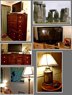
Proportion/Scale: Relationships of parts to the whole. The images below are examples of both good and bad proportions. Even though the gigantic armoire is disproportional to the size of the room, the TV and objects on either side are proportional to the armoire. The TV on top of the desk is too big for the desk in such a small area. The lamp on the table is the perfect size to fill out the table. The image of a tiny lamp next to a much taller one looks awkward when looking head on at the space. In the image of Stone Henge that I took in London, you can see how huge the stones are compared to the scale of the two humans in the picture.
Unity/Harmony: arrangement between all parts of a space that help it function together. Done through similar finishes, fabrics, colors, shapes, and textures. The sorority house is unified because all of the windows look the same and it uses the same three colors throughout. Although the blue and grey room has different patterns on each bed, the color scheme throughout the room makes it unified. The room with the hemp curtains is unified because both beds have the same covers and the pillows are the same color as the curtains and the decorations on them. Yellow and red are Chi Omega colors, and my room has many elements that are yellow and red to make it a unified space. When curtain colors match the decorations around them, it makes a space more unified. The plates in the parlor room are all the same style, unifying that space and making it formal, but different.
Variety: uses several elements of design to hold the viewer's attention. It guides the eye through the space. The examples of houses I have included all use different materials such as wood, brick, stucco, stone, and glass to give the structure and design variety. Inside of Yoforia, they use a grass material, wood, plastic, and a matte wall to create an interesting visual while you eat ice cream. Variety of objects used to decorate a room can create a more interesting and exciting scene, but can sometimes look overwhelming.


No comments:
Post a Comment